K2 Sports
Web and visual design / April 2015
New Desktop Design
Typeface is changed. I used Monserrat to give it a cleaner look.
Search bar is added on the header. Most users find it helpful that they can search for something they want right off the bat. At least to have that option is very useful in the purchase process.
Changed the call of action red color just a little bit to give it more of a younger and hip feel. I also changed the button from "Get It" to "Add to Cart" Sometimes users find the word "Get It" too intimidating because when they are not quite ready to buy, the word "Get It" can feel too final and "Add to Cart" feels like you can still change your mind if you want down the road.
I redesigned the layout to a more horizontal feel. Users can find too much information at all once to busy or cluttered. I know the marketing team wanted something "less cluttered" so I thought changing the layout horizontally made sense in presenting the right amount of information but still providing the option of additional information if customers want..
The arrow indicators tells users there is more information if they chose to browse more.
Overall the website has a "cleaner" look. Definitely less cluttered and allows the customers to browse easily.
New Mobile Design
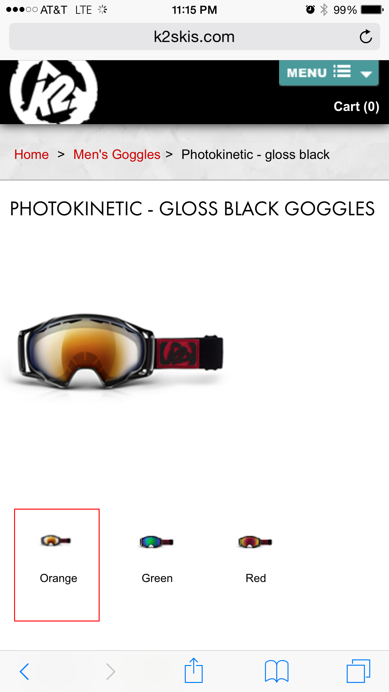
Same with the desktop redesign: typeface is changed and slight change to the call of action red.
Big hero picture is centered.
Layout is much cleaner. Got rid of the black block look of "Details, Technology, Lens Options, Reviews, Related Products" on the bottom. Turned it into a more simple look with just the black text. It already feels much less cluttered and easy to navigate.
Footer is also much cleaner than before. Smaller social icons gives it a sleek look while still allowing for functionality. Users are familiar with the icons' usage.


