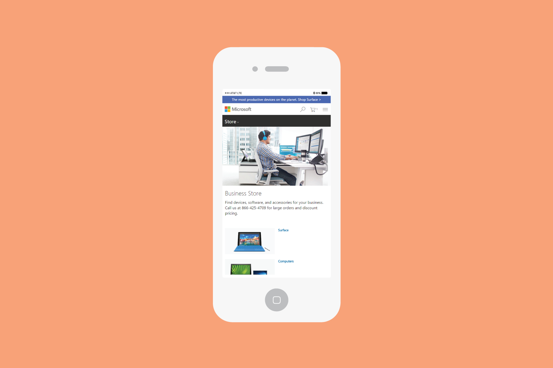
Microsoftstore.com Business Category Page
The business category page within Microsoftstore.com was in desperate need of a redesign. The old page had an unappealing color scheme and felt like spam. To improve its look, I went for a clean design and chose neutral colors. In addition to visual design, I also incorporated other vital design elements. The first version of the design had a black “sticky” navigation that was part of the teal color “slim hero” module. Unfortunately, we were forced to keep the “slim hero” module along with the “sticky” navigation. However, I wasn’t pleased with how cluttered it looked. In version 2, I removed the “slim hero” module and consequently, the “sticky” navigation too. This meant that users lost the important navigation links. To solve this issue, I created a four-across grid module to replace the “sticky” links. By using light grey as the main background color, the entire redesign looks more cohesive. The four-across grid provides users with quick access to the top category page, without the need for a drop-down menu at the top.
The problem: Outdated design. Need new design to implement promotional items to increase usability and visibility.
The solution/ goal: Improve design to increase visibility and usability. Decrease clutter.
Old Screenshot
Old design had too many colors and it was very distracting for our users.
Wireframe
Version 1
Another important UX component on the new design is to add a "Why buy from us" module. Letting our users know the advantages and why it was important for businesses to buy from the store.
Version 2
Only difference is removing the "slim hero" module and adding four-across grid as main category.


